Paying for things online can be a tough task, especially for people who aren't very confident users of the internet. One of the aims of GOV.UK Pay is to make it easier for the public and businesses to pay government.
There are some users who will never feel comfortable paying for things online; for those users teetering on the edge, building trust in the online card payment process is a very important and difficult thing.
We've been working on ways we can help build this trust, so users feel confident that they're securely paying for the right thing.
By testing the card payment process with this low confidence user group and making it easier for them, we believe we can make the process better for everyone.
Here are some things we've learned.
Reassure at every opportunity
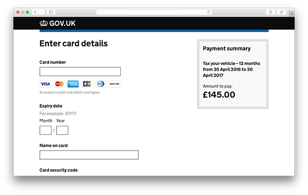
It’s important to reassure users at all points of the payment journey about the amount they are paying, and what they are paying for. The payment description is important and bespoke for each service, so:
- if the payment involves a period of time (eg 31 January 2016 to 30 May 2016) put this in the payment description
- have the amount they're going to pay clearly viewable at all times
Users like the comfort of being able to review and confirm details before they make the payment. If something happens too quickly, they can get anxious. To counteract this we put in a ‘confirm payment’ screen after the card details page. This shows a breakdown of their information and reaffirms what they are paying for. This gave the low confidence users time to make sure they were paying for the right thing, using the right card.
Button text is important. It should let the user know what will happen when they click on it, eg ‘Confirm payment’.
Clear confirmation pages are important
Getting confirmation pages right is crucial when building trust. These pages should:
- contain a reference number (make them short and usable)
- have a clear payment summary, showing the amount and description
- clearly state what is going to happen next (this will be different for each service)
- if applicable, let the user know they will receive a receipt email (services can either use GOV.UK Notify to send email payment receipts or ask GOV.UK Pay to do that for them)
Users have different ways of recording this confirmation information. Some take a screenshot, some want to print, others want a pdf receipt to download and some users simply write down the reference number and other relevant information. Teams building services should be aware of, and cater for all these behaviours.
Familiar cues help
The crown and crest on GOV.UK is a big source of trust. “It’s government, so I trust it”, is something we often hear. Paying should look and feel like part of the service - this is the user’s mental model. Payment pages shouldn’t jar in style or behaviour with the rest of the service.
Users don’t always notice the different card company logos (Visa, MasterCard etc), but if the logos are on the page it helps build trust.
When these logos weren't part of the interface users said the pages were very minimal and not what they were used to. These card company logos act as recognisable visual cues of payment, and since we've included them, observations and feelings of unease from users have reduced.
 Users of all abilities look out for the green lock icon in the URL bar (this amazed me). They are aware to some degree that it means security.
Extra context puts people at ease
Tell users why they are being asked for certain details. If you are asking for personal details like an email address, explain why, eg ‘Email address – We'll send your payment confirmation here’.
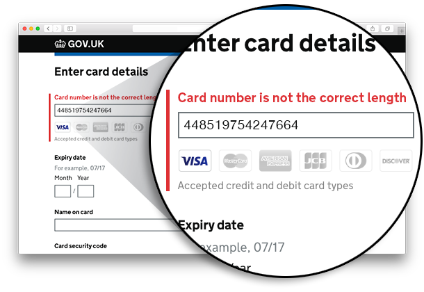
Inline error validation is important: users need to know if the information they've inserted is incorrect. We've included clearly worded descriptive error messages. This helps put the user at ease as they know what they need to fix to continue with their payment.
If an error or payment failure page is shown it's really important to tell the user that no payment has been taken from their account. Give them a clear link out of the error page so they can try paying again if needed. Error pages are hard: security and fraud issues often prevent us from telling users why their payment has failed.
These are just some of the things we've learned about card payments and user behaviour. As GOV.UK Pay grows, and we include other payment methods, we'll continue to monitor how low confidence users react.
By trying to build trust with low confidence users from the start, we've been able to make the card payment process as simple as possible for everyone.
If you work in central government and are interested in using GOV.UK Pay in your service, let us know.
Follow Stephen on Twitter and don't forget to sign up for email alerts.
6 comments
Comment by Will Reddin posted on
Interesting,
I recently did some usability testing on payment methods and trust and reassurance really was the main takeaway from all types of users. Particularly when asked why they still pay face to face or by using cheques.
I'd be interested to know GOV.UK's thoughts on recurring and subscription payments as this is often a big need for lots of public services, especially in the local government space. Is it on the roadmap and something that will feature in the live version of the service?
Keep up the good work, all looks very exciting.
Comment by Stephen McCarthy posted on
Hi Will, thanks for your comment. Glad to see our research findings align somewhat. Recurring payments is a big part of public services as you have mentioned. This has come out in our research when users talk about paying for things such as vehicle tax using direct debit. We have done some work in this area during alpha but for our MVP we have decided to focus on card payments. The ‘Our minimum valuable product’ section of this post (https://governmentasaplatform.blog.gov.uk/2016/03/31/building-pay/) explains why.
Comment by Eugene Victor Tooms posted on
Can you talk about how you protect the web site and its pages being subverted for malintent?
Comment by Stephen McCarthy posted on
Hi Eugene, The 'Focus on security' part of this post (https://governmentasaplatform.blog.gov.uk/2016/03/31/building-pay/) outlines the security measures we undertake that comply with the Payment Card Industry Data Security Standard (PCI DSS).
Comment by Adrien posted on
Interesting use of field labels to display error messages. It's the first time I see something like that.
Can you tell us a bit more about how it was perceived by users? Weren't they confused by not having a label anymore?
Thanks!
Comment by Stephen McCarthy posted on
Hi Adrien,
This is something we are trying out with GOV.UK Pay. So far during usability testing it hasn’t confused users. The important thing is that the content of the inline error message directly relates to the input the user needs to make. We have to do more work on this and make sure users understand all the inline error states. We also have to do more work with screen readers to make sure it’s a good pattern for everyone.